





01 About the project
Precision, innovation and trust.
SF Tools is an Argentine company specialized in high-precision cutting tools for the metalworking industry, based in San Francisco, Córdoba.
The challenge was to turn its industrial essence into a modern, solid and recognizable visual identity, able to convey precision, innovation and trust without losing its closeness to its customers.
My role. I developed SF Tools’ visual identity, from the creative concept to a graphic system that adapts to different media.
The project included the logo design, the color palette, typographic exploration, graphic resources and commercial and digital applications.
The goal was to build a brand that reflects its industrial origin and technical specialization, combining a contemporary aesthetic with a clear, functional and consistent visual language.
Design decisions.
· Brand concept. I started from SF Tools’ origin in San Francisco, Córdoba, and its link to the machining industry to build an identity with a personality of its own.
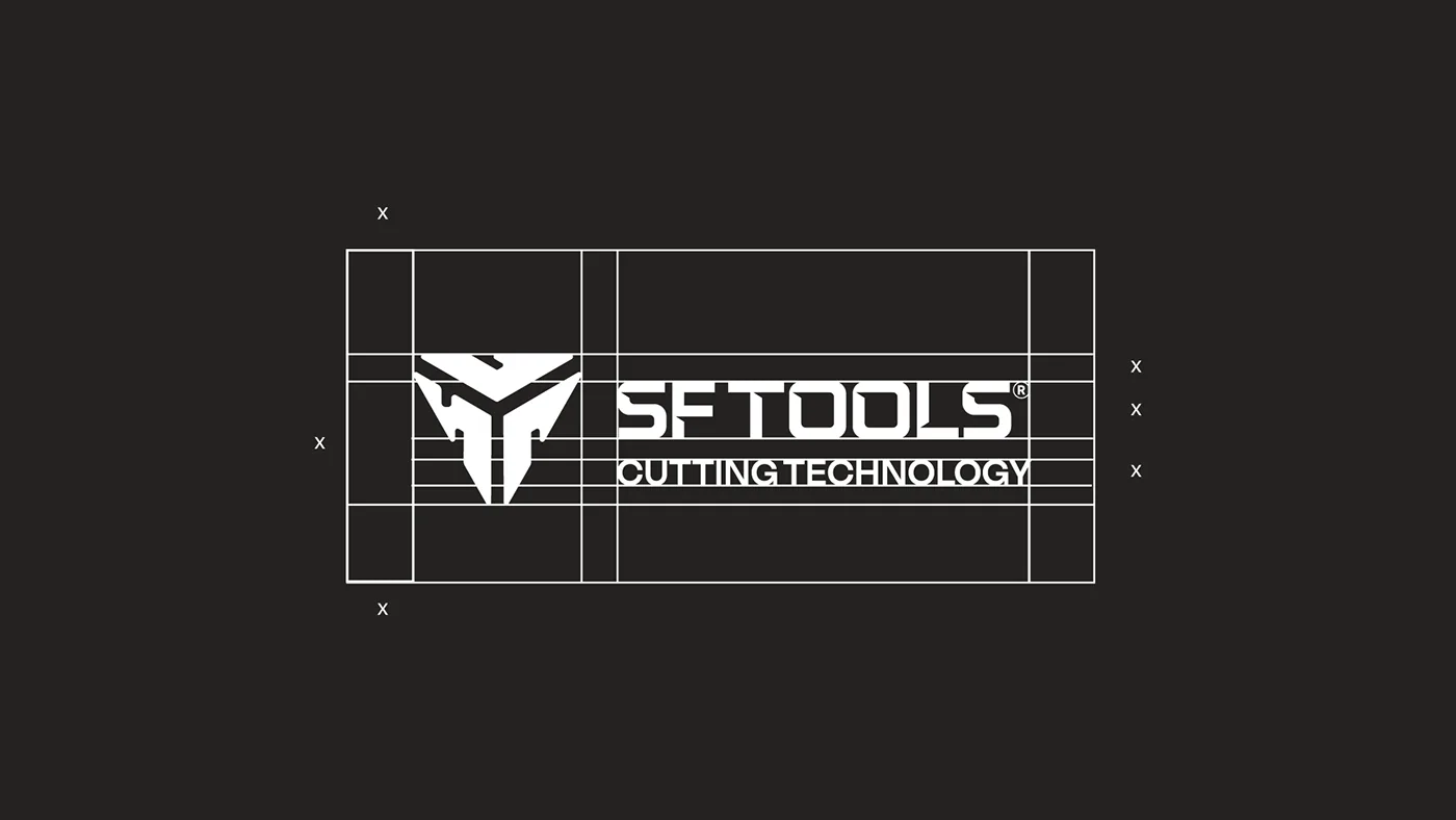
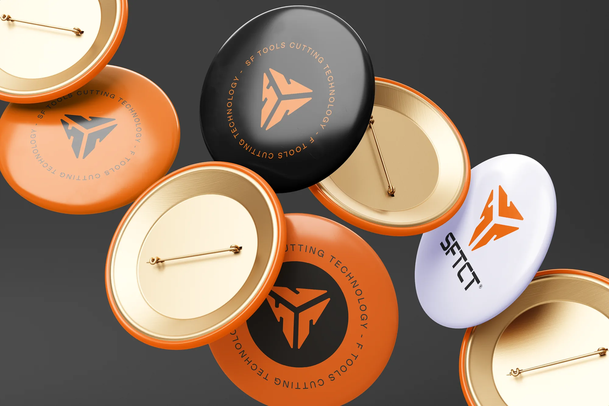
· Logo design. I developed a symmetrical, robust typographic construction, inspired by the precision of machining and the cuts of solid carbide tools.
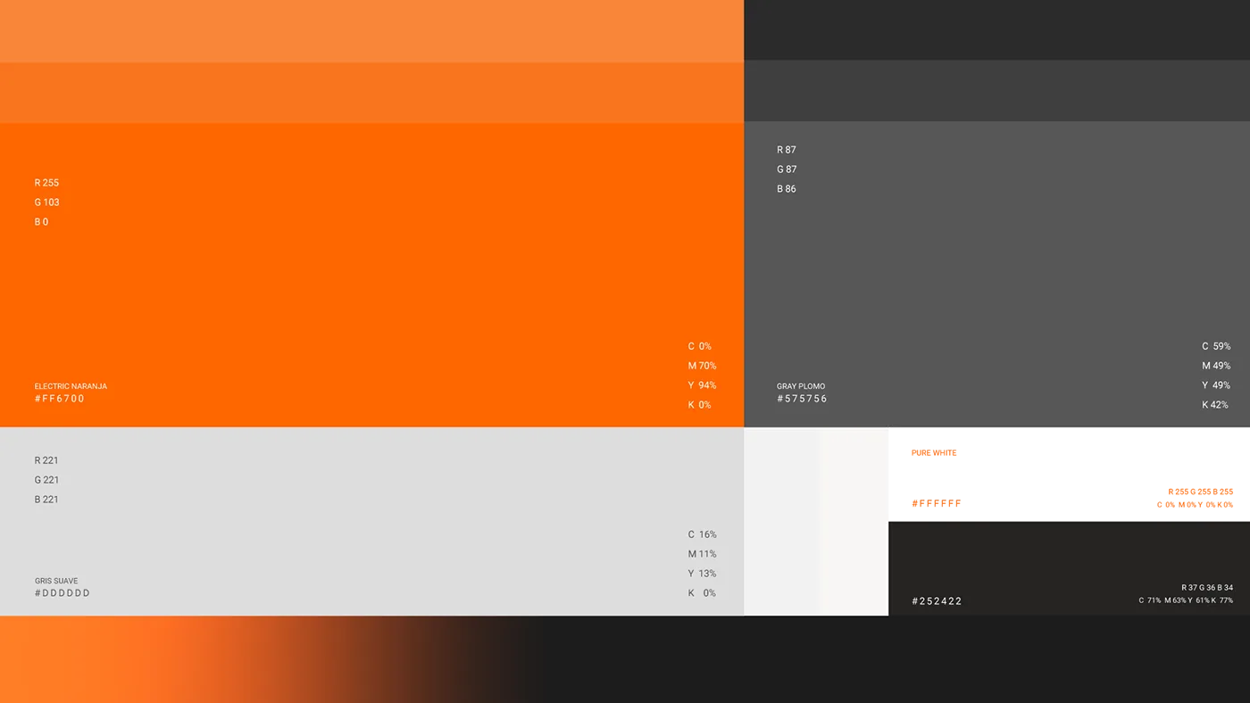
· Color palette. I worked with metallic tones, industrial greys and vibrant accents to convey strength, reliability and innovation.
· Graphic system. I created a visual language based on controlled geometry, technical patterns and compositions inspired by industrial blueprints and manufacturing processes.
· Art direction. I combined industrial typefaces, visual contrast and structured compositions to reinforce the brand’s professional positioning.
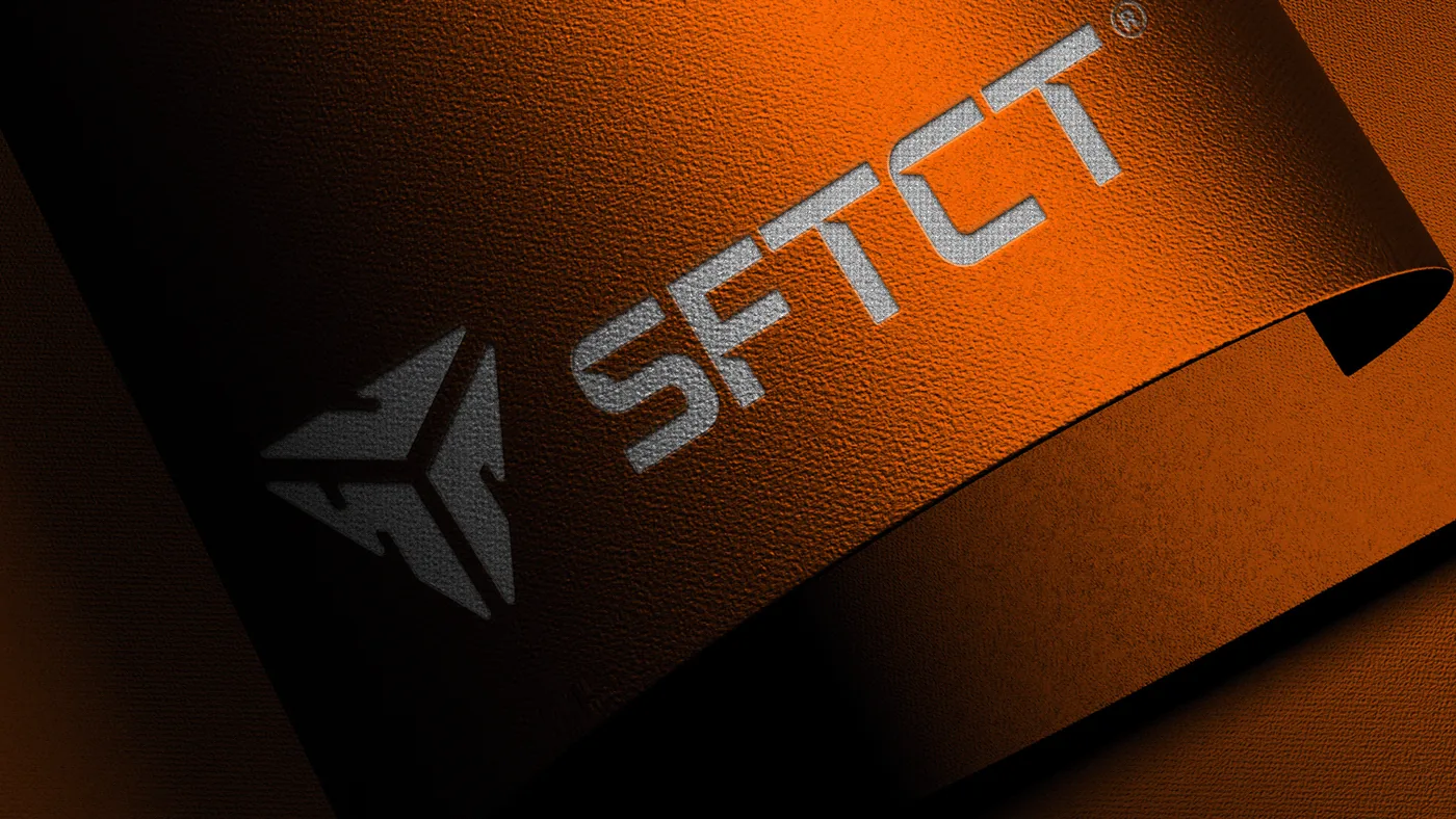
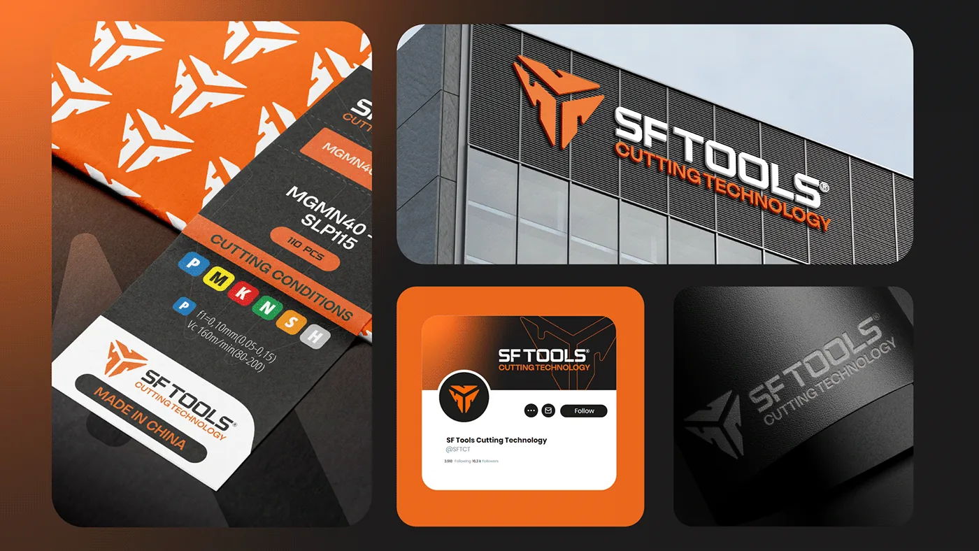
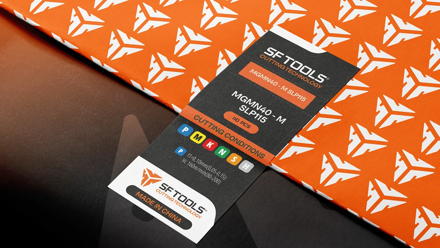
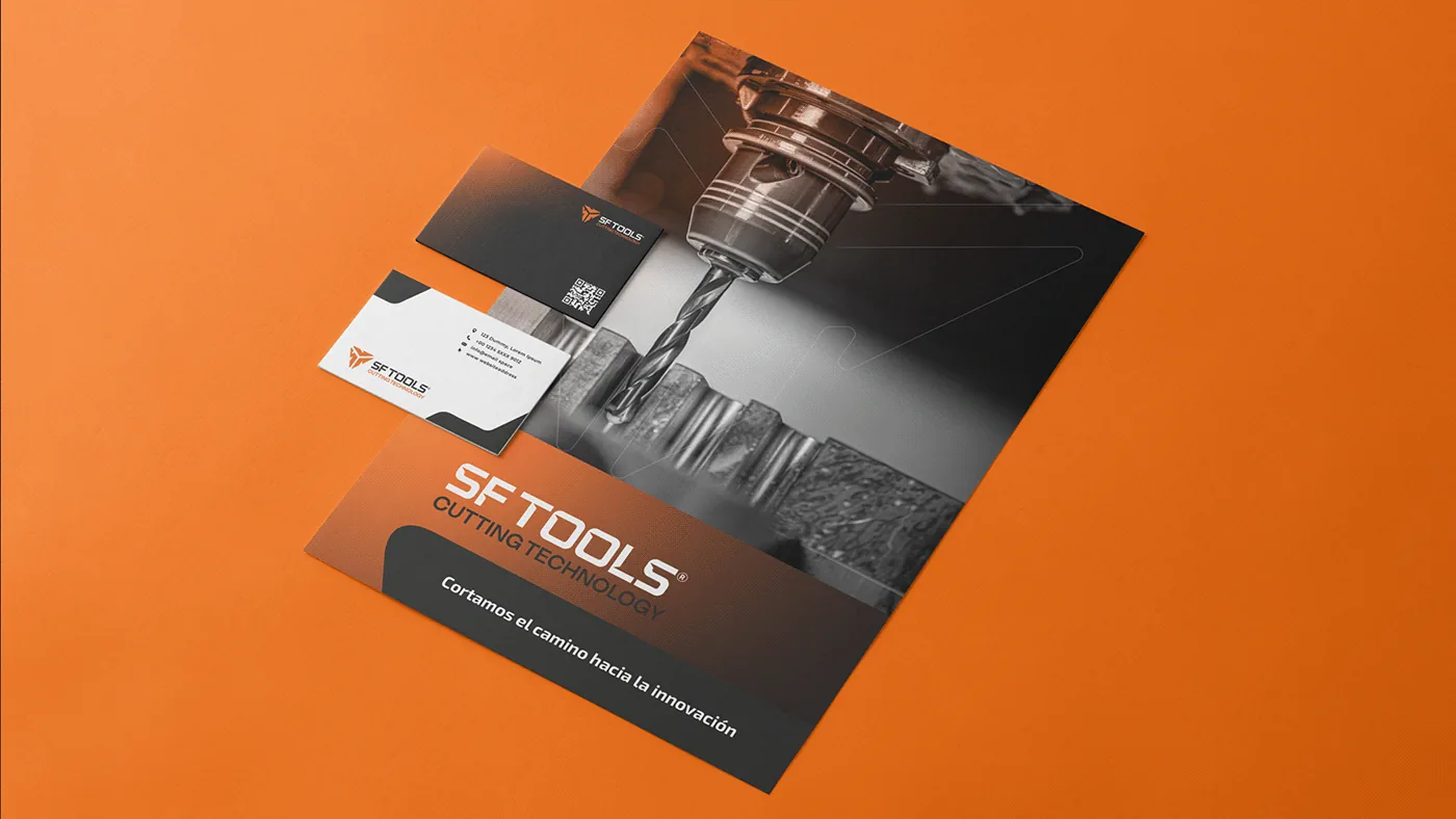
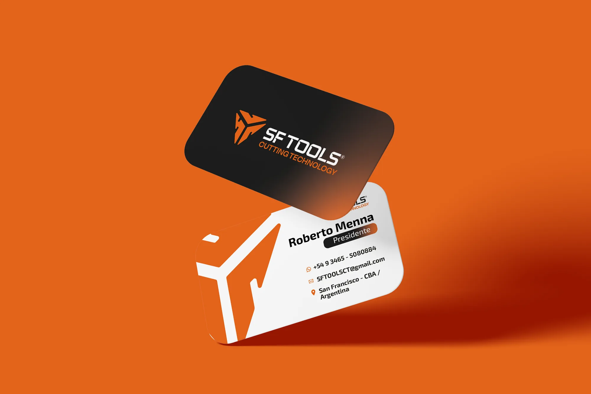
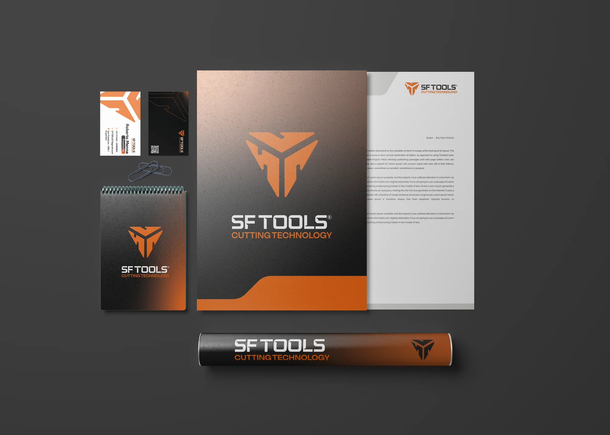
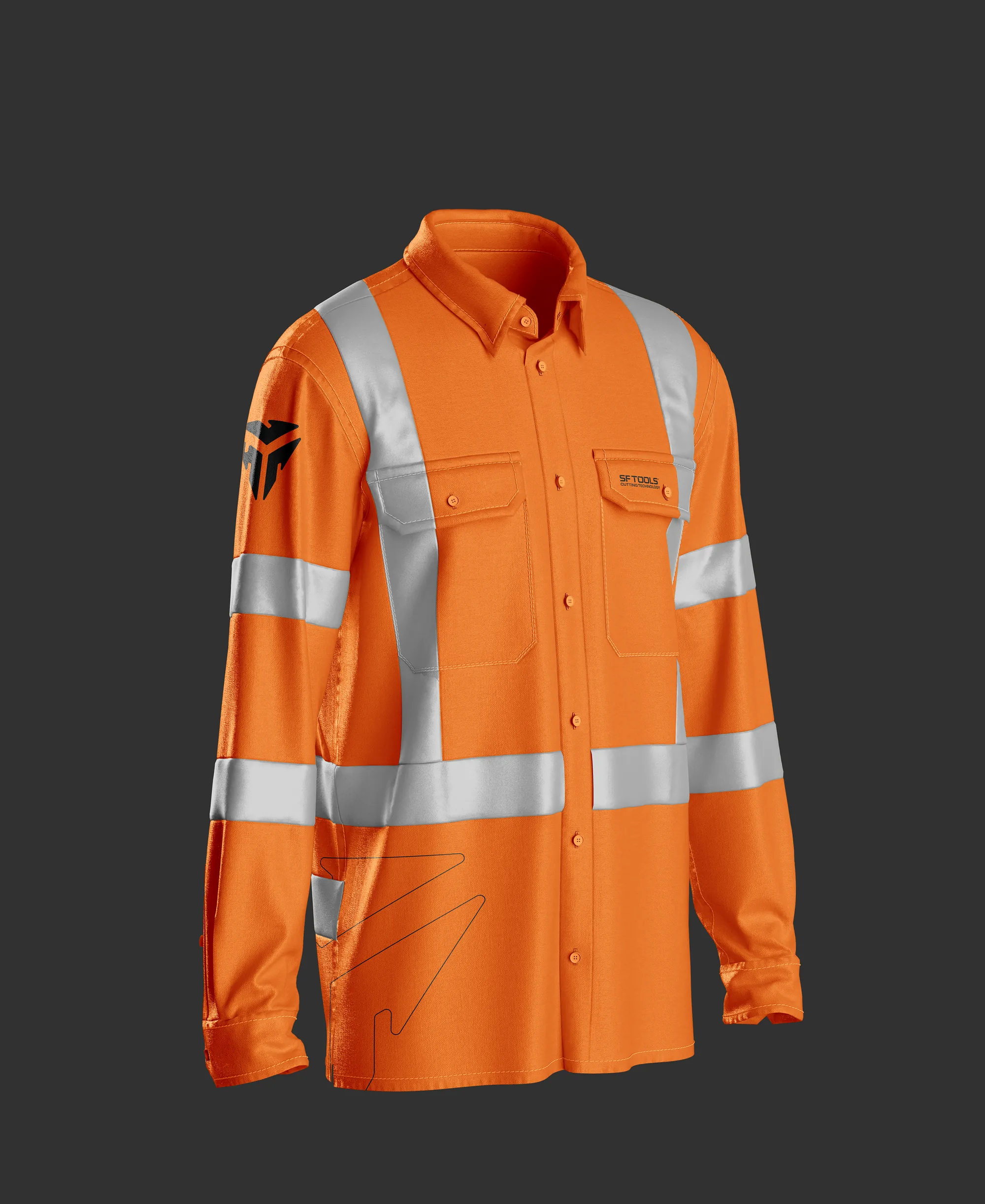
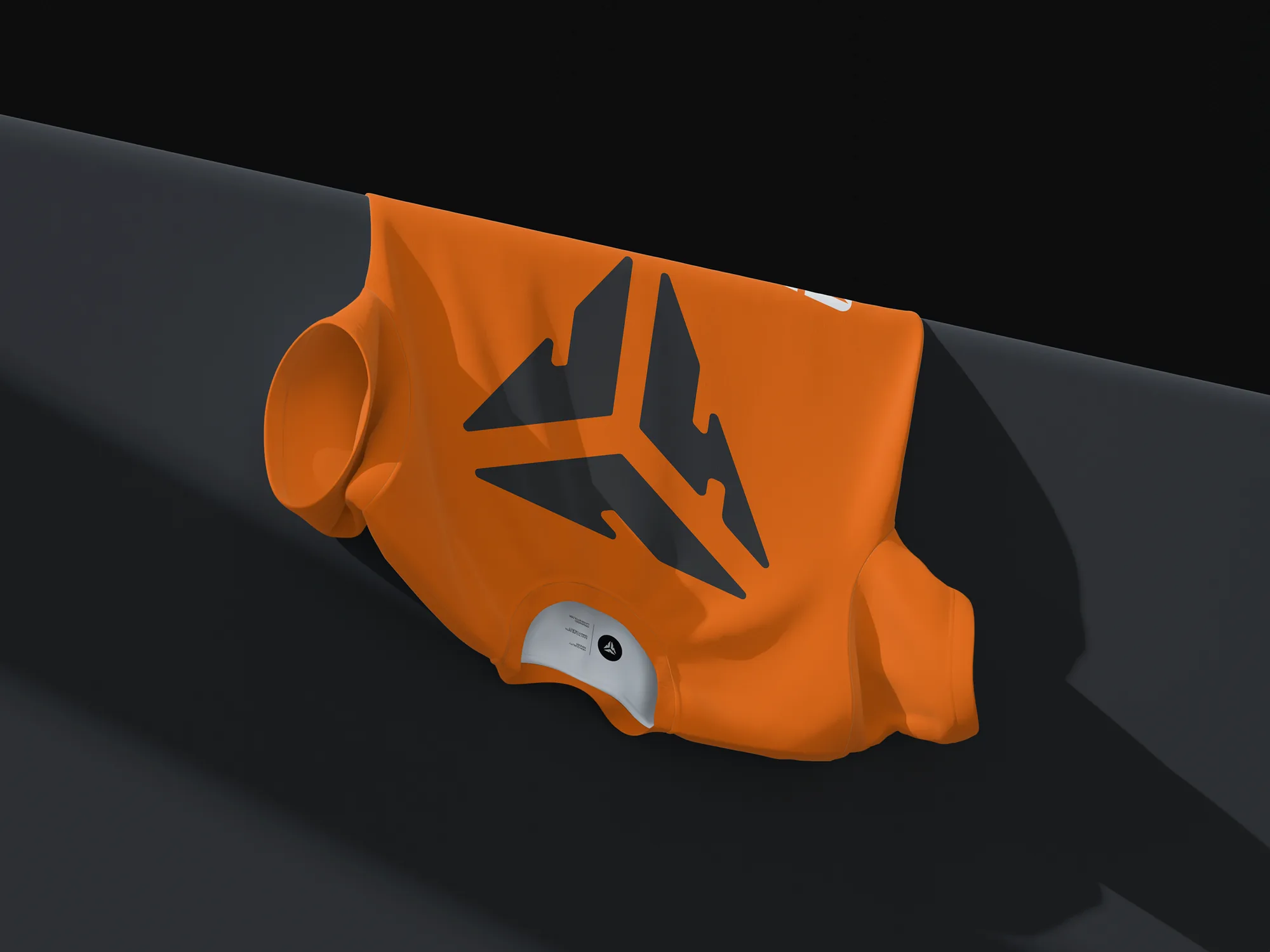
· Identity applications. I extended the visual system to catalogs, packaging, signage, commercial proposals and digital materials, seeking consistency at every touchpoint.
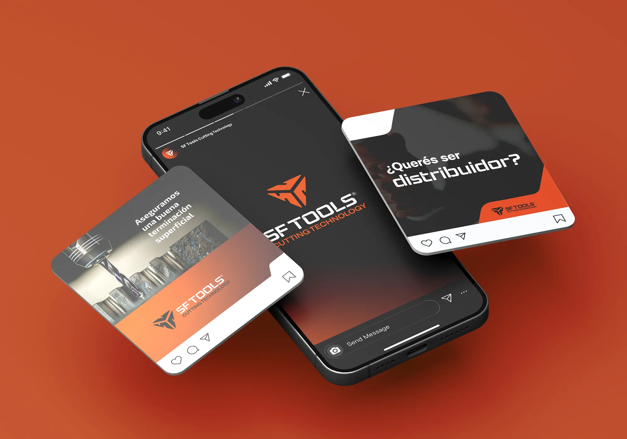
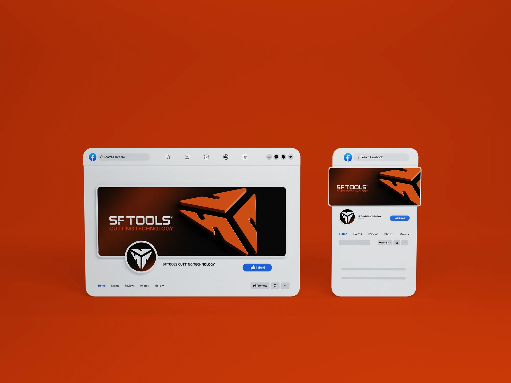
· Visual versatility. I built a system that adapts to different formats and scales, keeping a recognizable identity in both printed and digital media.
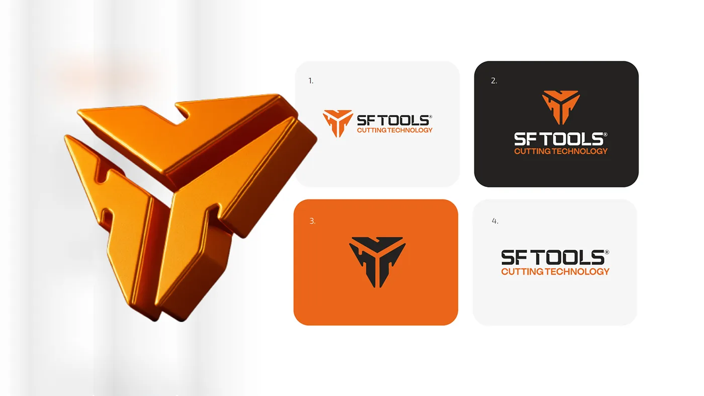
02 Logo design
A symmetrical, robust typographic construction, inspired by the precision of machining and the cuts of solid carbide tools.
03 Color palette
Strength, reliability and innovation.
Metallic tones, industrial greys and vibrant accents.
04 Graphic system
Controlled geometry.
Technical patterns and compositions inspired by industrial blueprints and manufacturing processes.

05 Visual versatility
Print and digital.
A system that adapts to different formats and scales, recognizable in both printed and digital media.
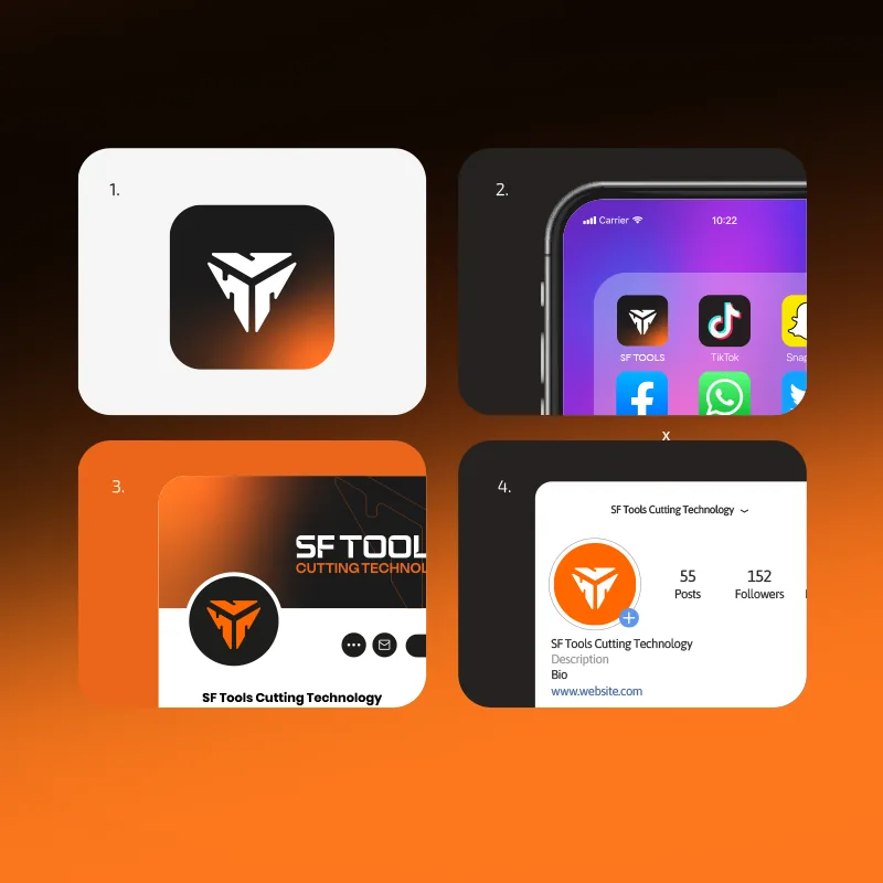 01 Social profiles
 02 Email signature
 03 Symbol in light
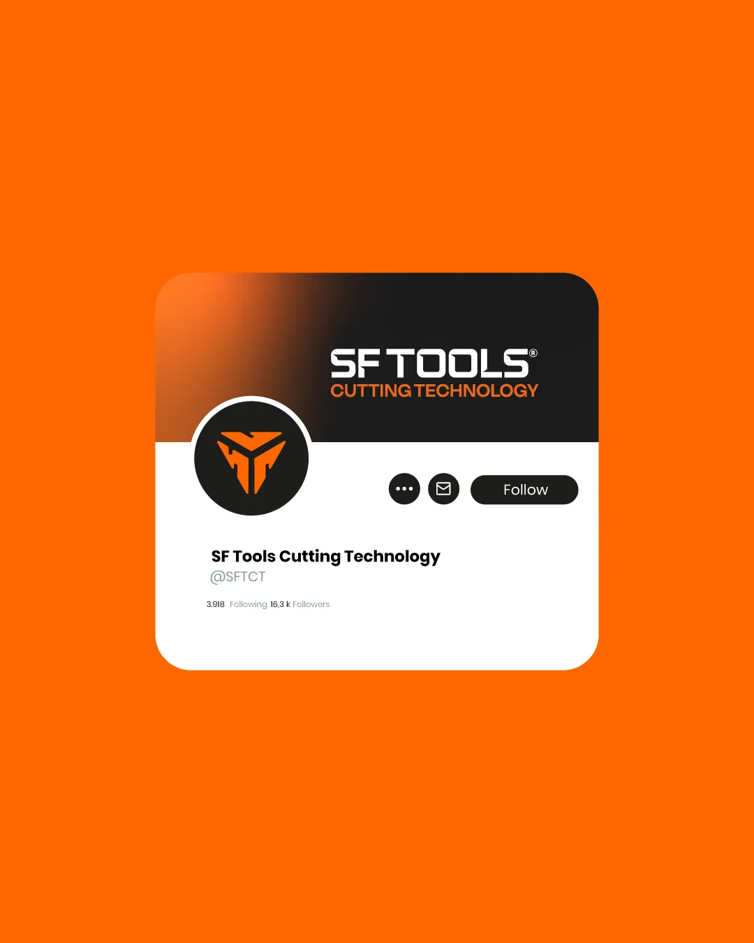 04 Social profile
 05 Web domain
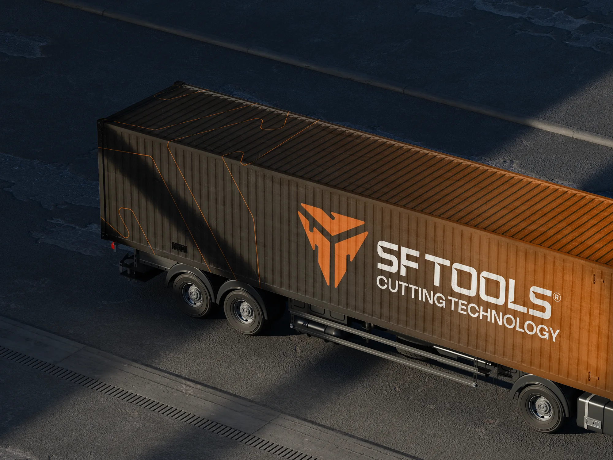
06 Art direction
The brand in motion.
Industrial typefaces, visual contrast and structured compositions.


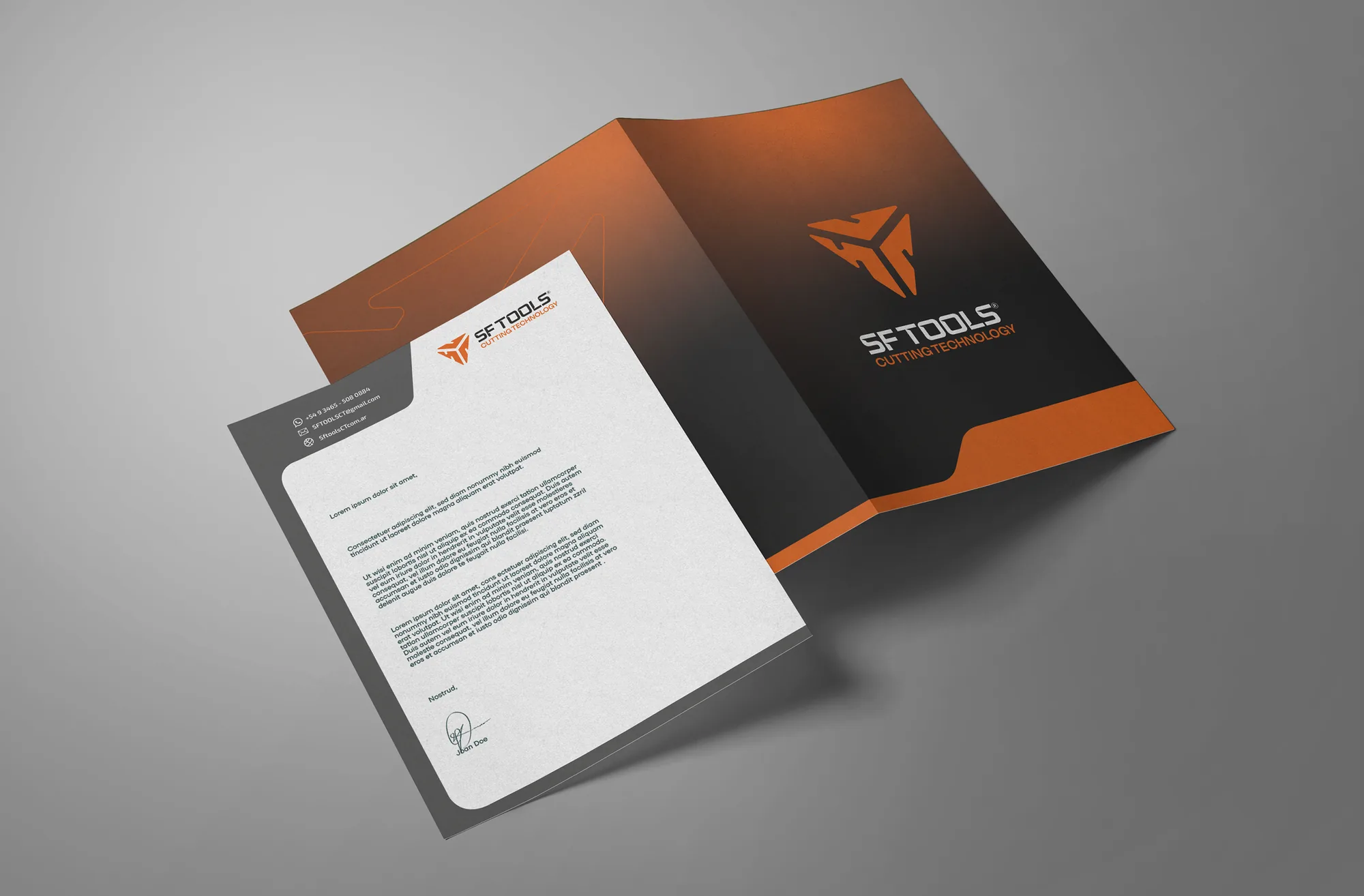
07 Identity applications
Consistency at every touchpoint.
The visual system, extended to catalogs, packaging, signage, commercial proposals and digital materials.
The result
SF TOOLS · Cutting Technology
A solid, modern and coherent visual identity that connects SF Tools’ industrial origin with a contemporary aesthetic. A graphic system designed to convey precision, professionalism and trust, strengthening the brand’s presence across its commercial and digital applications.