




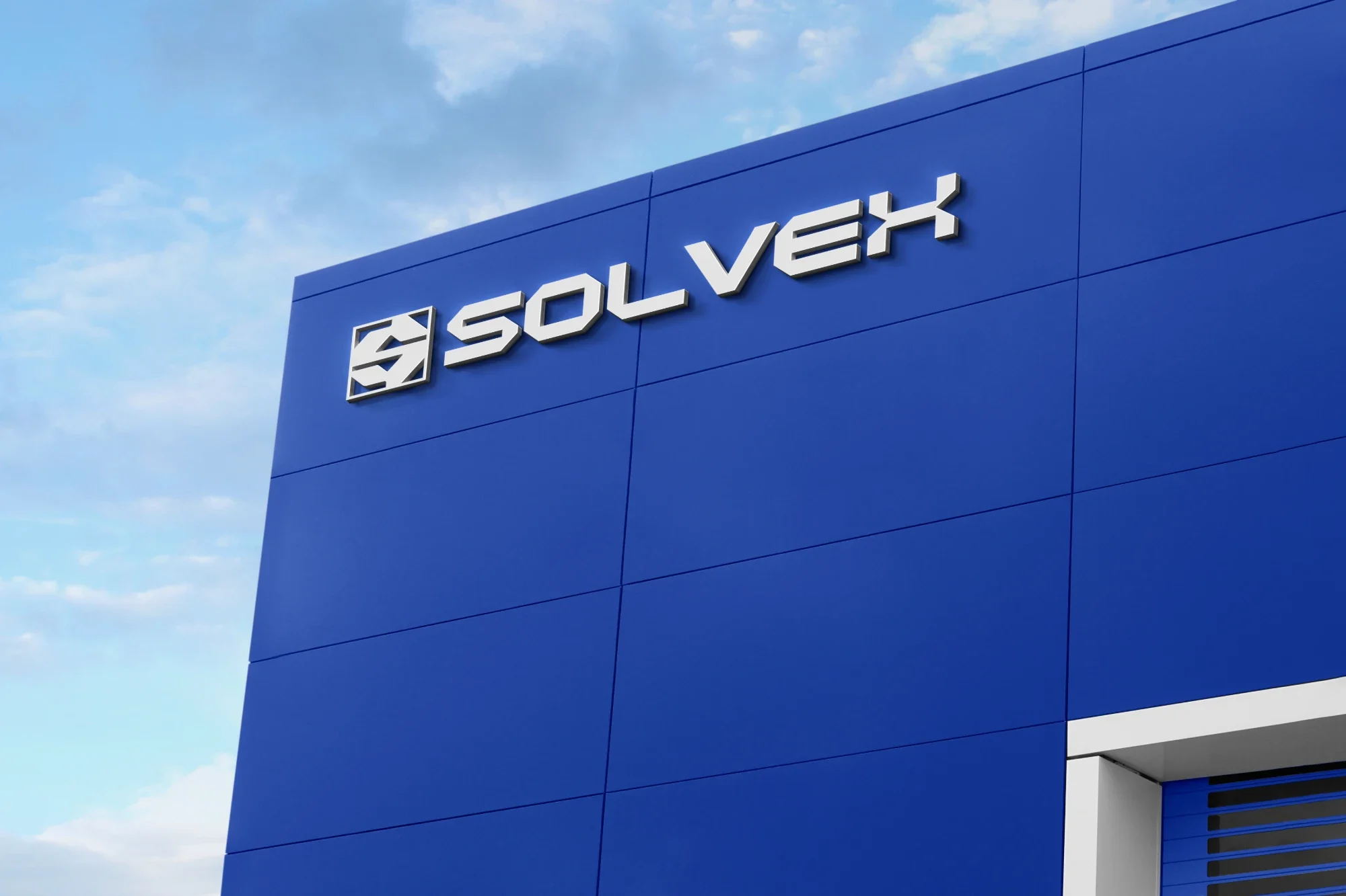
01 About the project
Precision and solidity, without losing the human side.
SOLVEX is an Argentine industrial solutions brand that combines technical knowledge, innovation and personalized service. Its offer goes beyond selling supplies: it aims to become a reliable ally for companies and professionals who need efficient solutions and specialized advice.
The challenge was to build a modern, technological and recognizable identity, able to convey precision and solidity without losing the brand’s human, approachable side.
My role. I developed the SOLVEX identity from its strategic concept to a complete visual system. The process included research into the industrial sector, analysis of the competition and the target audience, and defining the positioning, brand personality and tone of voice.
Building on that strategy, I designed the logotype, symbol, type system, color palette and graphic patterns, along with their applications across physical and digital media.
I also developed the visual identity manual, setting the rules for building and using the brand to ensure consistency at every touchpoint.
Design decisions.
· Brand strategy. I defined its purpose, mission, vision, values and value proposition, building a positioning based on technical knowledge, trust and personalized support.
· Personality and communication. I worked with the Sage and the Loyal Friend archetypes, developing a clear, professional and human tone of voice that combines technical advice with closeness.
· Research and target audience. I analyzed the needs of business owners, purchasing managers, technicians and industrial professionals to build communication aligned with their everyday challenges.
· Logo design. I created a geometric typographic identity with precise cuts and robust shapes, inspired by technology, engineering and constant evolution.
· Symbol design. I developed a geometric synthesis of the letter S, designed to keep the brand recognizable in small formats and digital applications.
· Color system. I chose electric blue as the lead color, alongside black, dark grey, light blue and white, creating a high-contrast identity that conveys innovation and solidity.
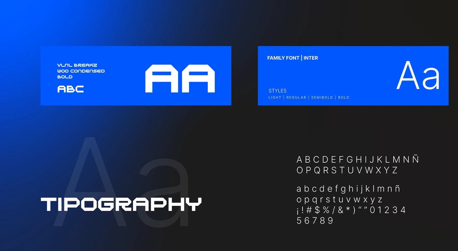
· Type system. I paired VLNL Breakz W00 Condensed Bold for personality and visual character with Inter to ensure clarity and legibility in communication.
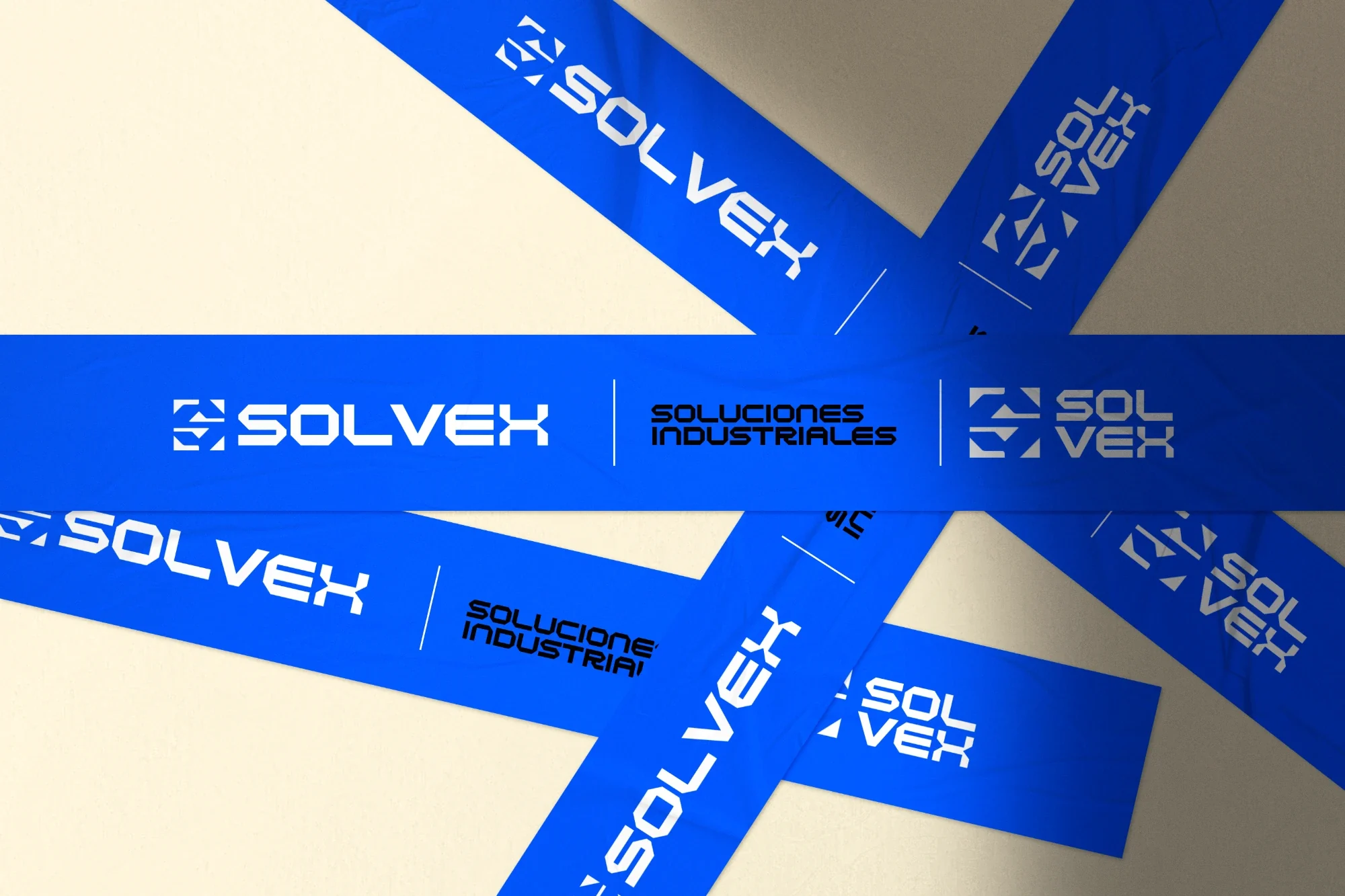
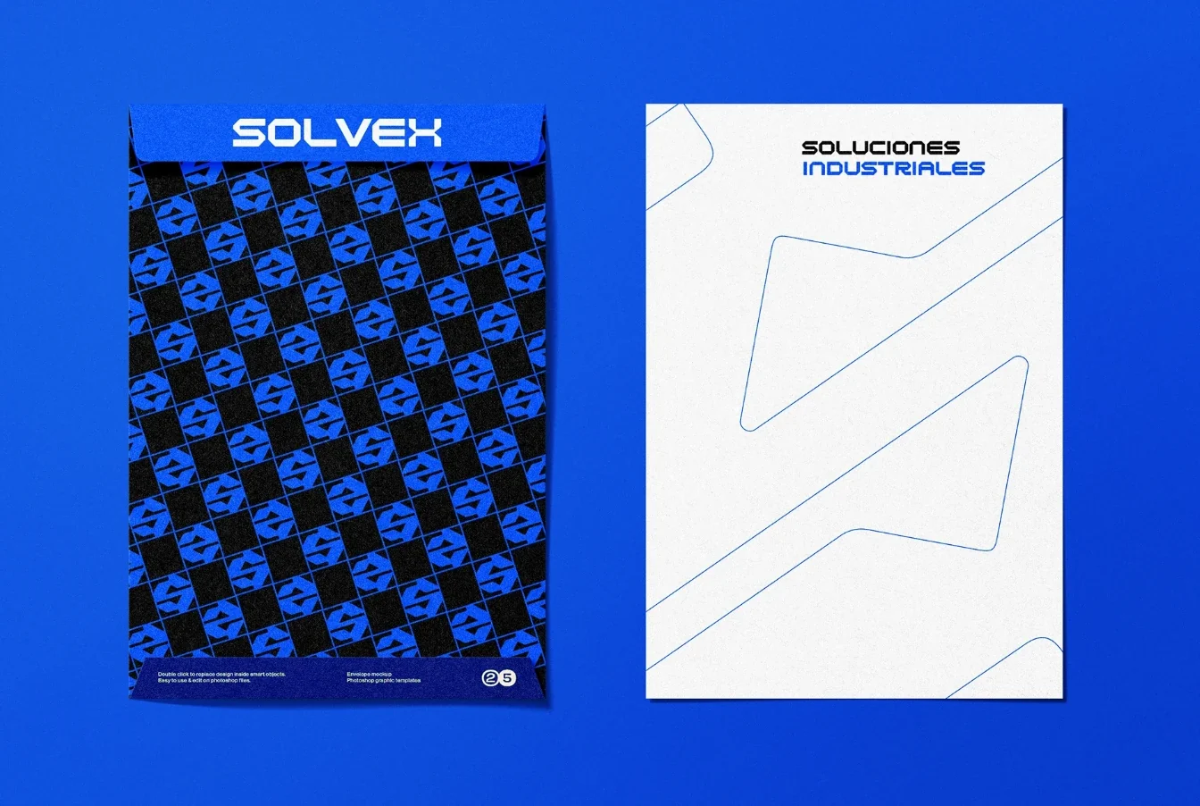
· Graphic patterns. I built a system of geometric patterns derived from the symbol, creating versatile, recognizable resources for different applications.
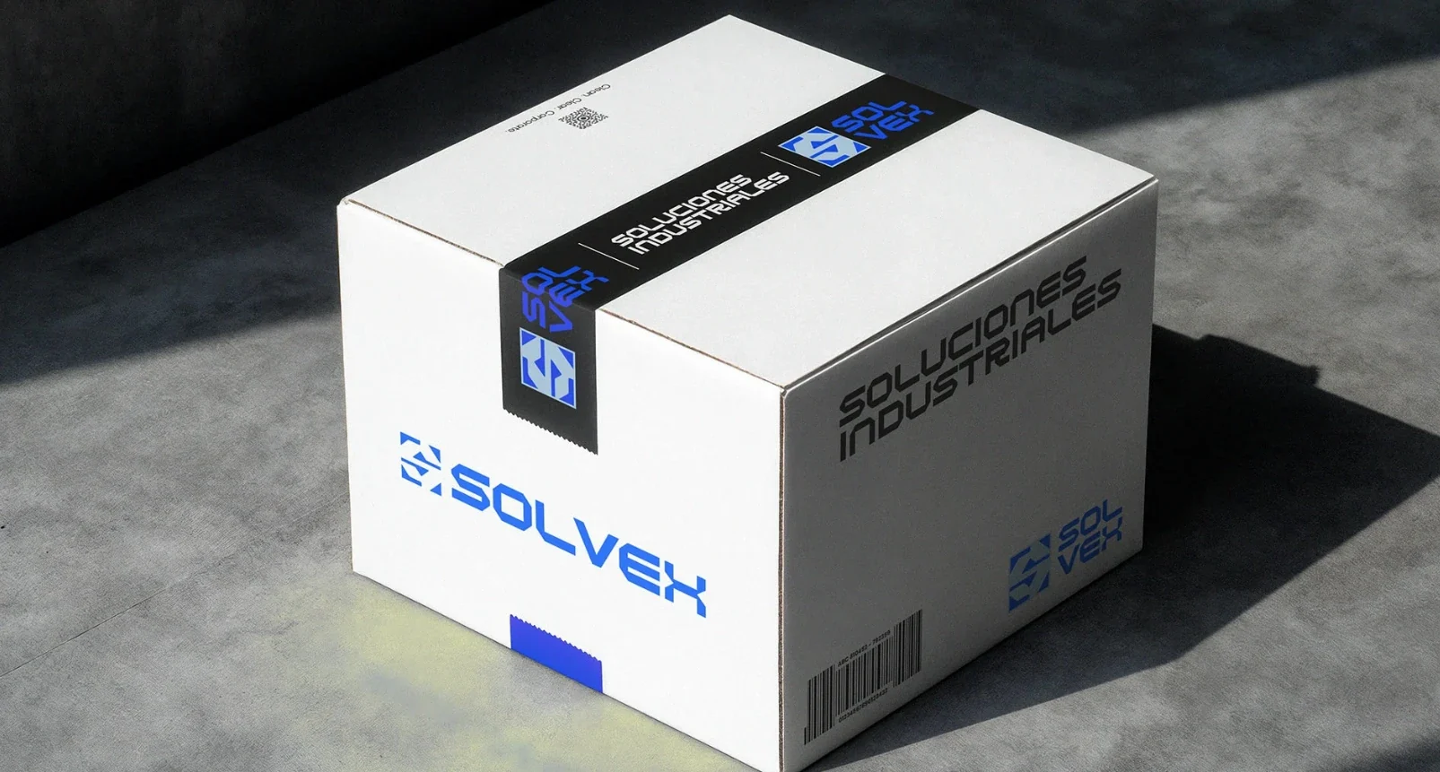
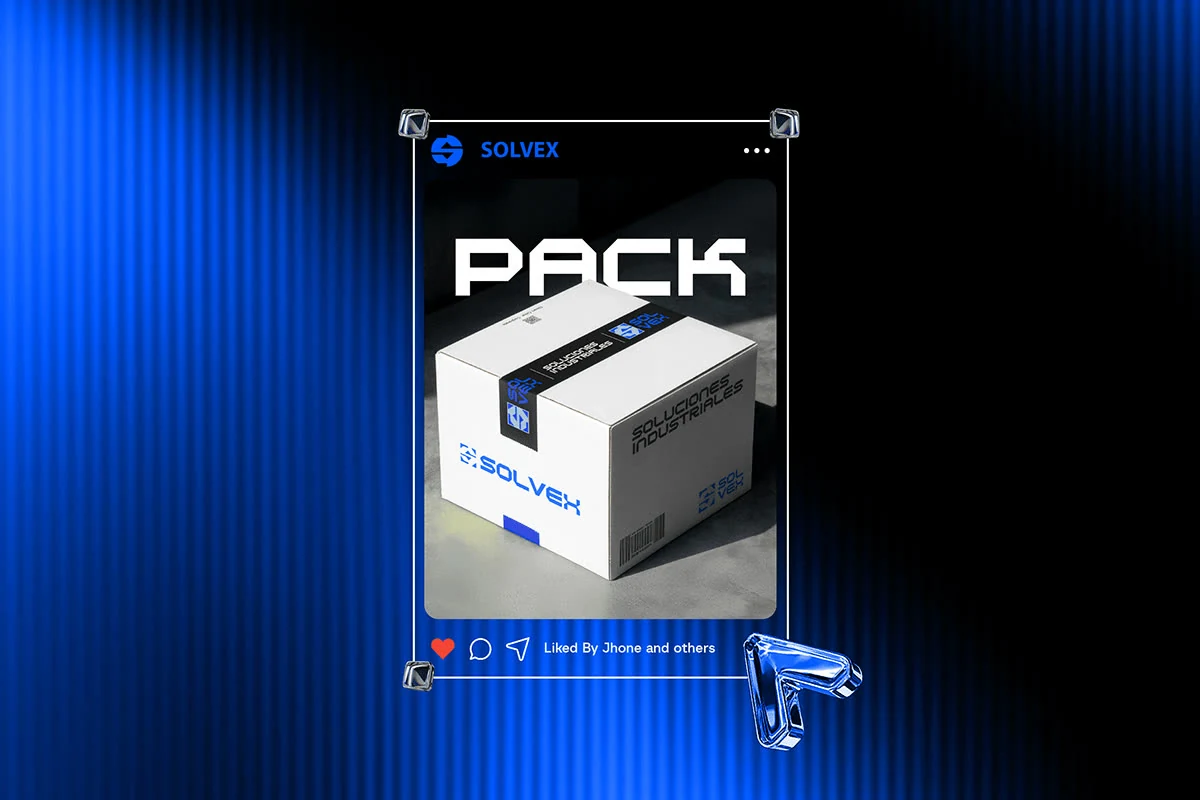
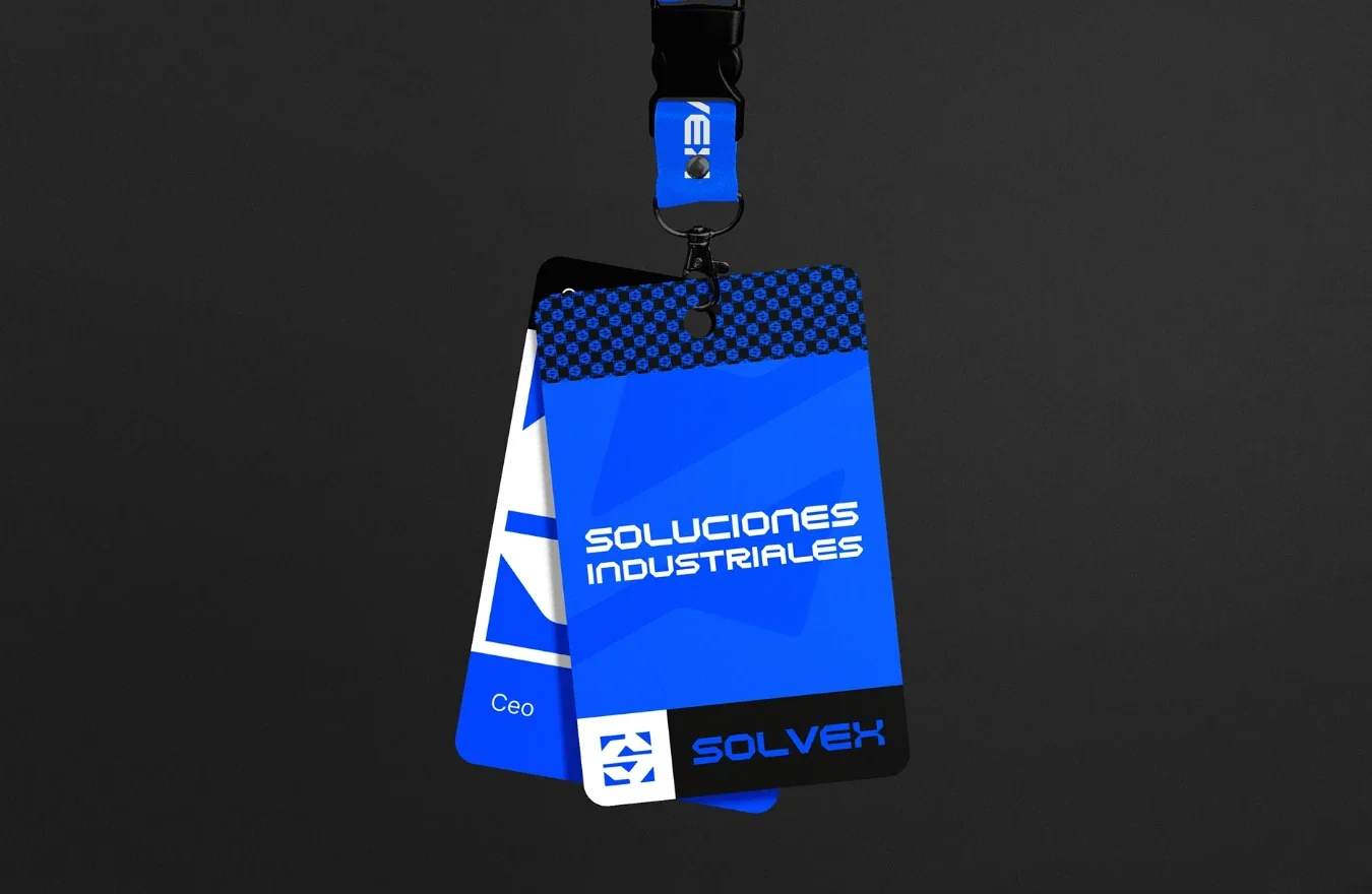
· Brand applications. I extended the identity to packaging, apparel, badges, stationery, promotional pieces, digital media and exterior signage.
· Brand manual. I documented the logo versions, clear space, color variants, incorrect uses and visual guidelines to ensure consistent implementation.
02 Logotype
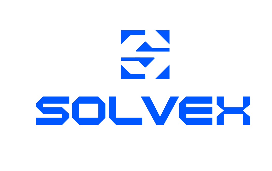
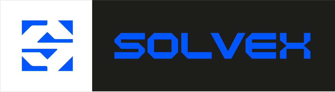
Shield + S + V.
A geometric synthesis of the letter S, designed to keep the brand recognizable in small formats and digital applications.







Versions.
A geometric typographic identity with precise cuts and robust shapes, inspired by technology, engineering and constant evolution.

03 Visual language
Electric blue and high contrast.
I chose electric blue as the lead color, alongside black, dark grey, light blue and white, creating a high-contrast identity that conveys innovation and solidity.
Brand colors
Secondary colors
Tap a color to copy its code.
04 Brand showcase
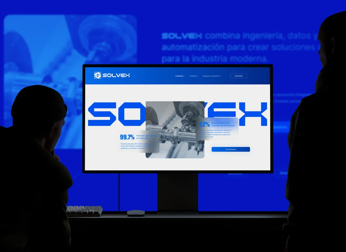
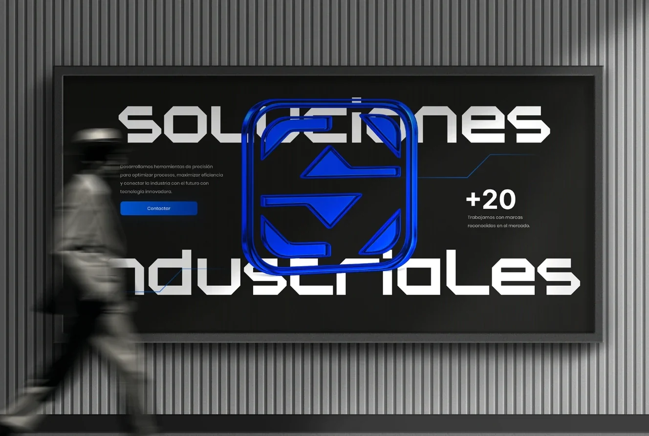
The brand on screen and on the street.
-
01
Website
-
02
Street billboard
-
03
Posters
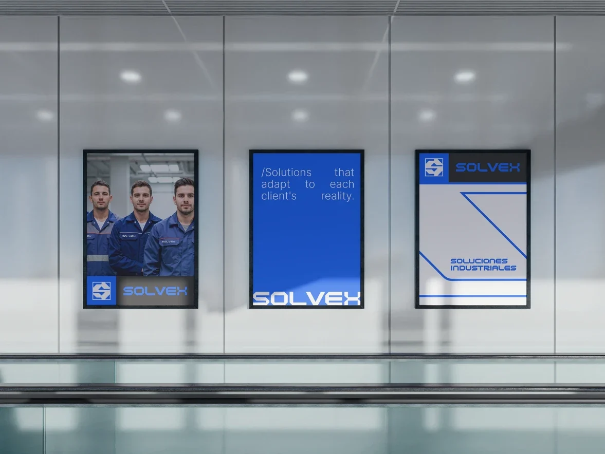
Packaging and stationery.
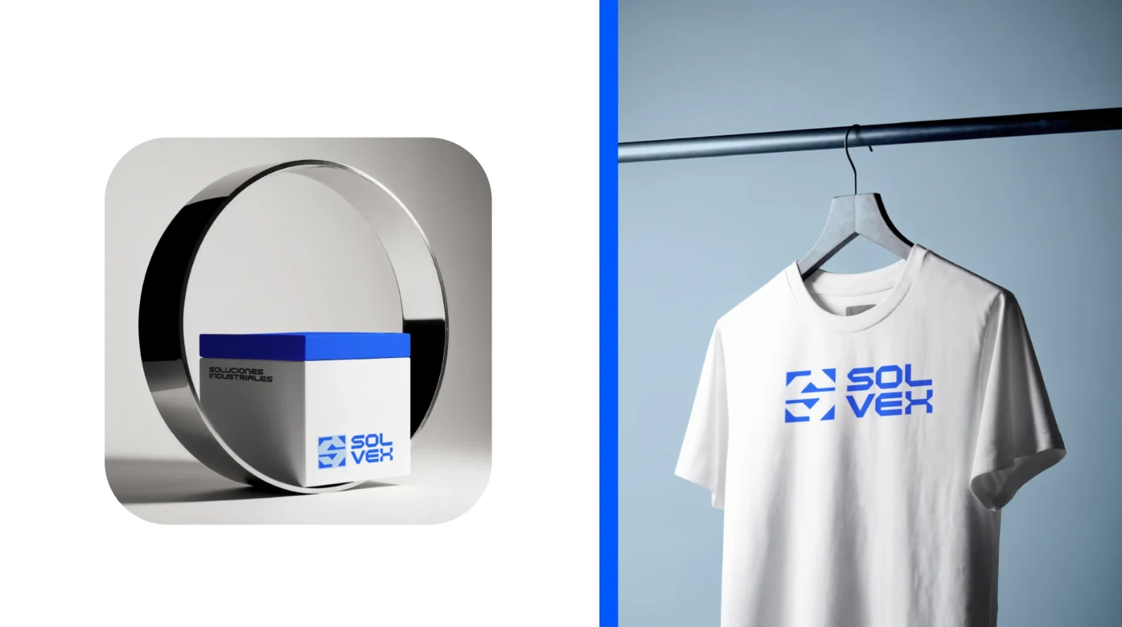
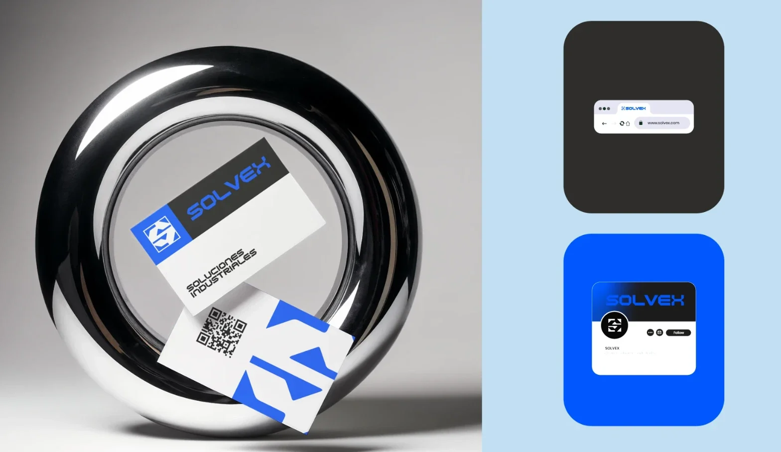
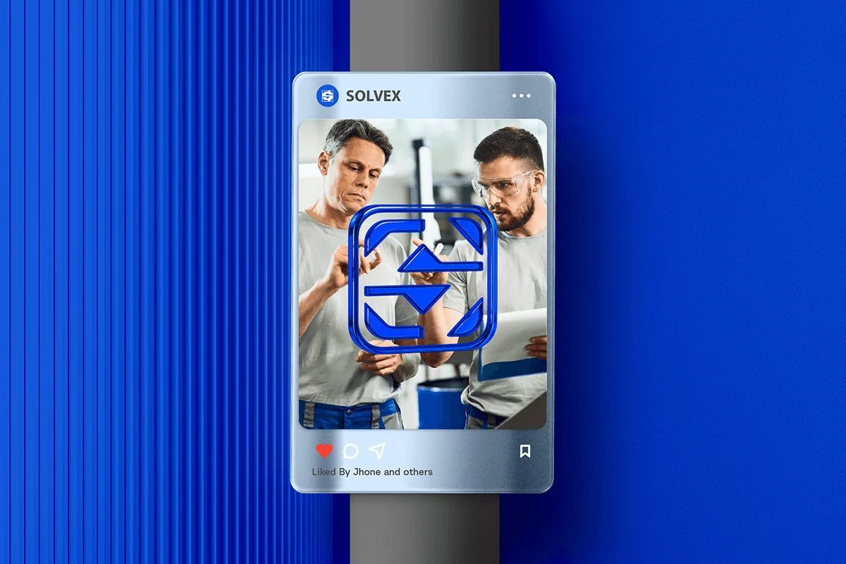
Badge and social media.
05 Applications
On the move.
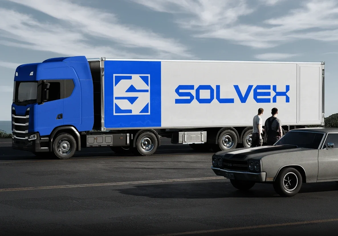
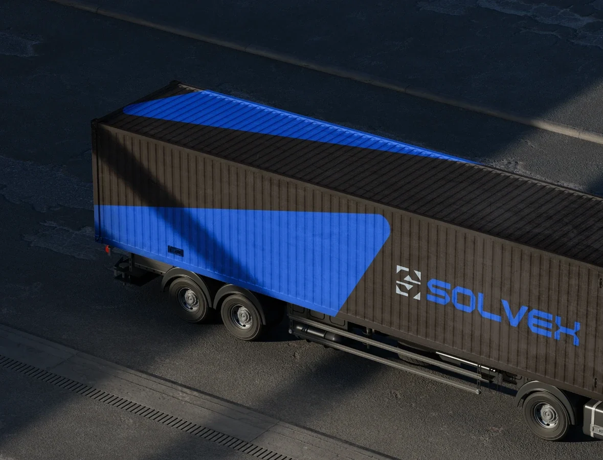
Transport
I extended the identity to packaging, apparel, badges, stationery, promotional pieces, digital media and exterior signage.
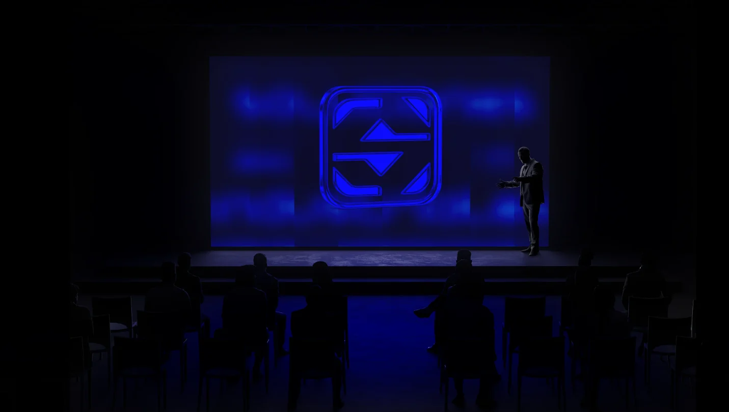
The result
SOLVEX · Brand Identity
A contemporary, versatile visual identity that connects the technical precision of the industrial sector with closer, more human communication.
A brand system built to convey trust, innovation and professionalism, with recognizable graphic resources that adapt to different platforms and touchpoints.